Case Study | Prohibition
Client: Prohibition Hair
Brothers Reece and Matthew hairdressing salon, Prohibition Hair was relocating in Leeds’ City Centre and saw this an opportunity to rebrand the salon.
They are both inspired by the emerging art movements in the 1900s; William Morris and his Arts & Craft movement and the beautiful sumptuous Art Deco period with its angles and indulgence of the speakeasy salons, as a result of prohibition in America. They wanted a logo designing professionally in order to ensure originality and to fit in with their theme.
Delivery
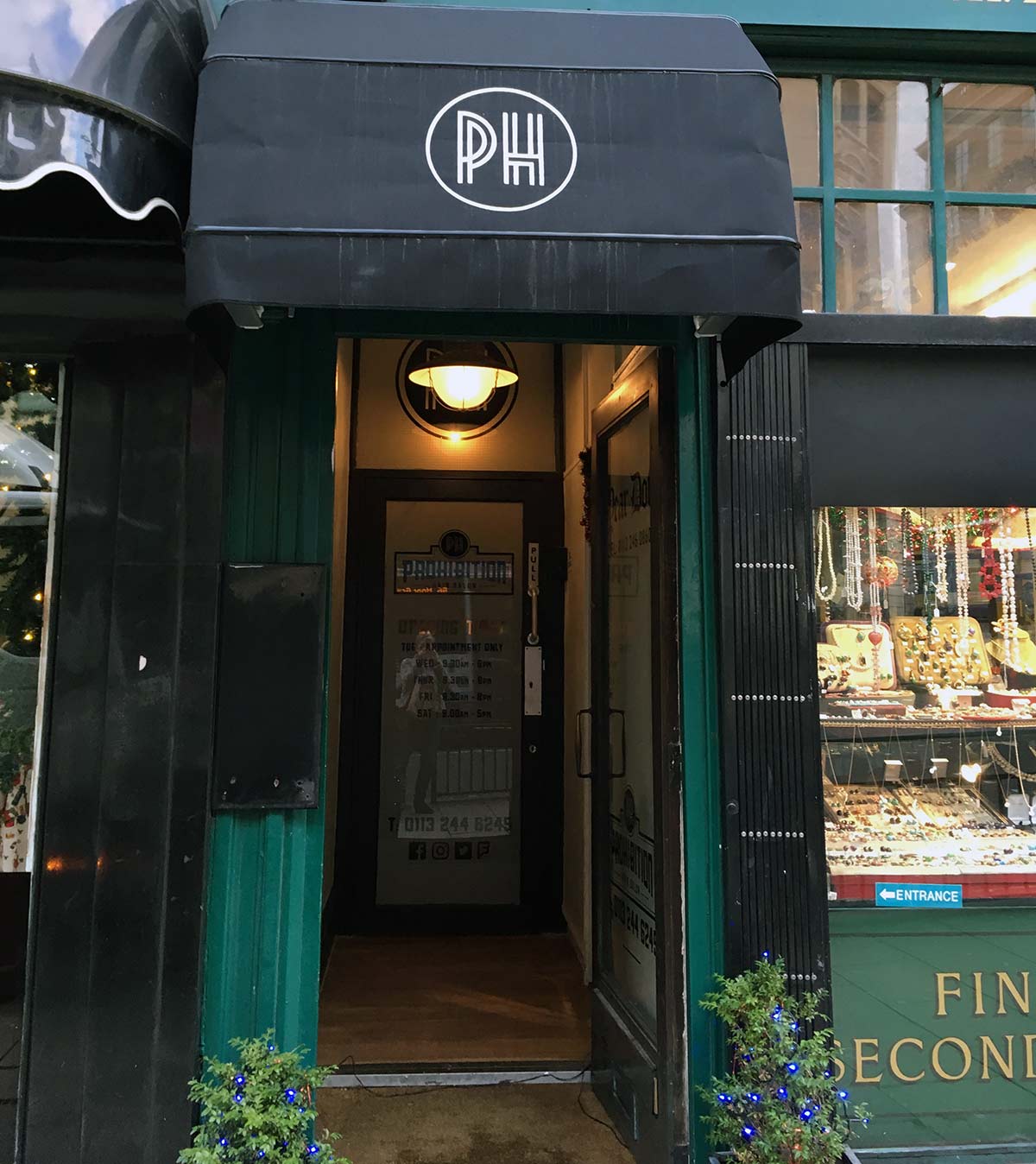
Their new 3 storey salon, Prohibition Hair, lent itself perfectly to the 1920’s speakeasy theme and we it to become known as Leeds’ best-kept secret – kept behind closed doors. They wanted their customers to have an experience, not just a haircut! I designed a series of 1920’s style logos and a final design was chosen for their new salon. I also designed and produced the posters, flyers, business cards and appointment cards as well as the interior décor and signage. Using the gorgeous copper foil vinyl really lifted the logo on the glass giving it an air of sophistication.
Results
Prohibition Hair’s doors opened this year on The Headrow after lots of Pinterest boards, sweat and tears to get the salon ready. Cutting edge hair design, great surroundings and brilliant staff – perfect!
The rebrand worked well and gave a new lease of life into the salon, attracting new customers who had seen the social media marketing and flyers, and were intrigued to find out more.
“Sarah listened to my ramblings, perused my Pinterest board and made suggestions for the interior of the salon. The logo designs she presented were phenomenal and it made it very difficult to choose a final design. The logo design we went for lent itself perfectly to the 1920 theme of the salon and the signage just brought it to life! Sarah is great to work with, very passionate about design and her attention to detail is outstanding. Couldn’t have done it without her! “


